If a game built with AI gets rejected because it “looks AI-made,” you’d probably blame the AI-generated art. In this case that wasn’t it. The problem was the UI wrapped around the art. The more painful part is that the fix had already come up twice before the rejection, and both times it got pushed aside.
This is a dev log for Phone Deco Clicker, a web clicker game that QuestBrief’s operator is building. You collect falling materials, craft decorations, and use them to dress up a phone case. Since July the workflow has been the operator setting direction and Claude Code writing the code, and Claude shows up as co-author on most of the commits. The pixel art for items came from an image generation model. Everything below is drawn from the project’s commit history and its architecture decision records (ADRs). The portal it was submitted to isn’t named here, and QuestBrief has no relationship with the portal or with the makers of the tools mentioned.
The reworked version is playable right now in the QuestBrief Playground.
The art was fine. The screen still looked AI-made
The portal didn’t give a reason for the rejection, so what follows is the operator’s diagnosis.
Pulled apart piece by piece, the pixel items and props mostly had consistent outlines and lighting. What stood out was everything around them: a dark purple gradient sprinkled with stars, translucent glassy chips, blurred shadows, rounded buttons fading from pink to purple, a handwriting font, and a color emoji on nearly every line. None of that is bad on its own. Put together, though, it’s the look of a typical web dashboard. Drop pixel art into the middle and you’ve got three visual styles on one screen. The operator’s conclusion was that this mix is what made the game feel assembled from parts rather than designed.
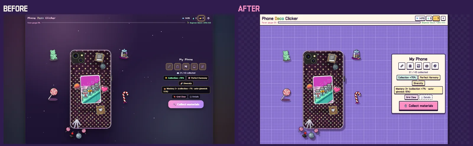
Left: at the time of rejection. Right: after the rework. The art in the middle didn’t change, only what surrounds it. Image: QuestBrief operator’s dev build
Here’s the takeaway. When you build with AI, the “AI look” tends to come less from what the AI generates and more from defaults nobody actually chose. Ask a coding agent for a clean UI and you’ll usually get something smooth and safe in a generic web style. That’s not wrong, but it has nothing to do with your game’s identity. Go through what’s on screen and ask who picked each thing. If the answer is “nobody, it was the default,” that’s worth a second look.
First miss: a rule that got filed under “later”
The right direction was on record back in July. Design feedback said the slick UI clashed with the retro pixel style, and the project wrote down a rule: the UI goes pixel art too. The bigger pieces of work, like swapping the font, got pushed to a later step. After that, only a handful of icons actually changed.
In hindsight that was the worst outcome. A half-applied style rule looks messier than no rule at all. You end up with pixel icons sitting next to a handwriting font and glossy emoji.
Decisions about a screen’s overall look don’t split well into increments. Features can ship piece by piece, but a visual style that’s halfway through a change looks worse than either end. If you’re going to defer it, defer all of it. If you’re doing it, do it in one go.
Second miss: measuring only what could be measured
Right before submission, the remaining emoji work came up for review again, and the analysis was careful. The worry that emoji render differently across devices was tested on Windows and Android, and nothing broke. The cost turned out bigger than expected, because swapping emoji inside text for icons meant reworking how text got drawn on screen. That left one reason standing, “it breaks our own rule,” and the record dismissed it like this:
“An internal consistency problem, not a problem players run into.”
The flaw was in what got measured. Whether things break and what it costs are both measurable. How a stranger reacts to the whole screen at first glance isn’t, at least not that way. So the measurable factors ended up overruling the unmeasurable one, and the unmeasurable one is what came back as a rejection. The record written after the rejection rewrote the verdict, calling the same inconsistency evidence of a problem “real players (the reviewer) actually hit.”
It’s easy for a decision to lean toward whatever has numbers behind it. Something like first impressions isn’t unsupported just because it doesn’t show up in a measurement. It needs a different kind of check. Showing the screen for ten seconds to someone with no context and asking what kind of game it looks like would have done it. That check matters most right before launch, when you’re deciding what you can skip.
What made the reversal easy: writing down why
The fix after the rejection was quick. In four commits on the evening of September 30, the font switched to the pixel font Galmuri, glassy panels and gradients became opaque paper surfaces with ink outlines, and decorative emoji were stripped out. The speed came from the records.
This project logs why each decision was made, separately from what changed. That rule lives in CLAUDE.md, the file Claude Code reads at the start of every session, since each session starts with a blank context. Because July’s rule and August’s reasons for deferring were linked together, the September session knew exactly what it was reversing and why, without anyone re-explaining the history. The technical snag that blocked the work in August was written down precisely too. So this time the work went around it instead of through it, with a tiny font that draws just a few currency symbols as pixel art.
What to get right before the tech
The second review hasn’t come back yet. What this rejection taught holds either way.
The first lesson is document structure. When you build with AI, a lot of the trial and error comes from “wait, why did we do it this way?” A person half-remembers the reasons behind past decisions. A fresh AI session knows only what’s written down, so it’s easy to rerun the same debate or undo a deliberate choice because it looks like a mistake. Keep the current spec, the change history, and the reasons for decisions in separate places, and have the AI read that entry point at the start of every session. That cuts the repetition a lot. Keep the wrong decisions too, marked “amended” instead of deleted. In this game, the August call was still on record, so September could fix it straight away instead of relitigating it.
The second is design consistency. It’s so basic that it’s easy to push down the list. AI will give you a decent button, a decent icon, a decent panel, each on its own. Whether those pieces fit together like one person chose them is a separate job, and it’s yours. This game wasn’t rejected because AI helped build it. It was rejected because perfectly reasonable defaults in different styles ended up on the same screen. Everything can work fine, but if the screen looks mixed, players read it as a game nobody really put care into.